
Opay's dashboard
App Redesign
.png)
As the Product Designer, I:

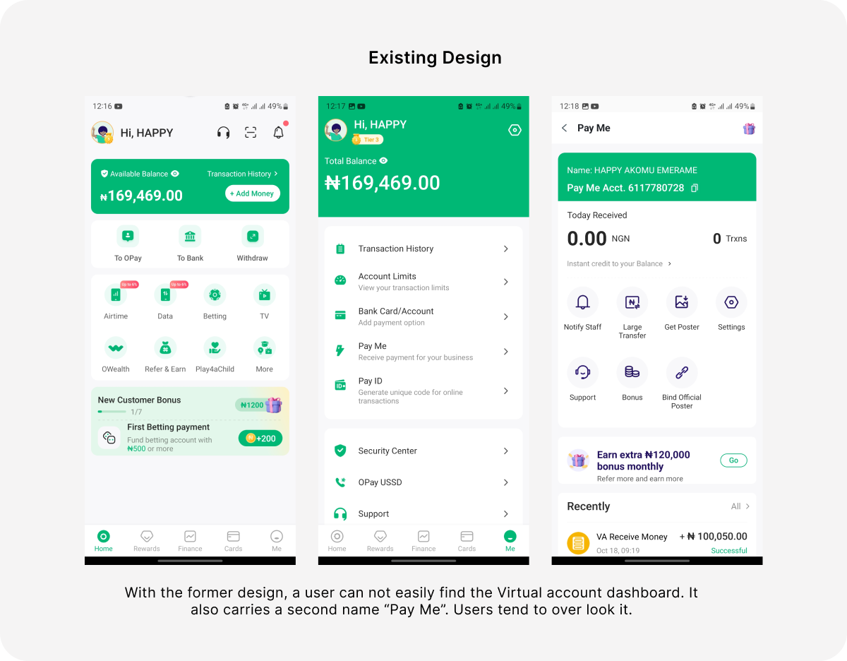
Opay users often:
This reduced transparency and forced inefficient steps for core tasks. The goal was to surface critical features and improve access within the dashboard itself.
The redesign:

Need a design that stands out? Let's turn your vision into reality. Get in touch for a free consultation and for your designs!


.png)
.png)

.png)
.png)


